3-Step Strategy for Never-Boring Neutral Home Decor
By Jennifer Hunter | Last Updated: Jan 10 2023 | 5 min read

It’s Reboot Month here on Style Girlfriend. From your wardrobe to your attitude to your home, get ready to rethink and retool your way to a lifestyle upgrade for the new year.
Guys, let’s talk about your home. For anyone who’s found themselves entranced by Mari Kondo’s new Netflix show, you probably have a few bags of stuff to donate, and suddenly a whole new outlook on what sparks joy in your home. Beyond the holy socks that you’ve decided not to bring into your future with you, there may be some furniture and other decor odds and ends that didn’t make the cut.
That doesn’t mean it’s time for a full-blown home makeover, but it could be the perfect time to make a few updates that make you more comfortable in your home. Now, while this might not be true for all of you, I’ve found that a lot of guys prefer things pretty neutral.
So, if lots of color makes you cringe, you may simply be more suited to decorating your home with soothing neutrals. But there is a right way and wrong way to do it. Lack of color doesn’t have to mean lack of interest and style, you just need to work a little harder to get a personality packed home. Here’s how to get a subtle, layered look that (softly) screams sophistication.
Below, three tips on neutral home decor in interior design for a far-from-boring home:
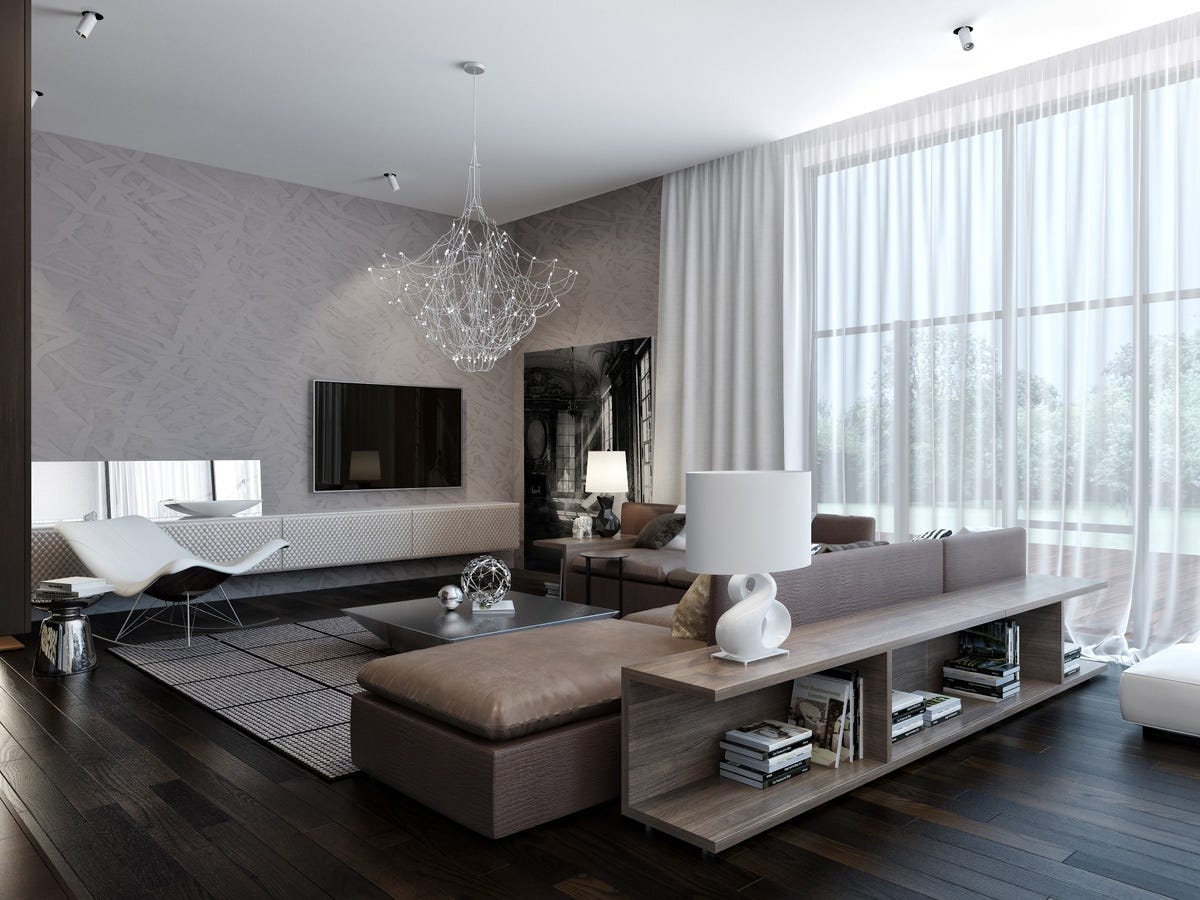
1. Introduce Texture
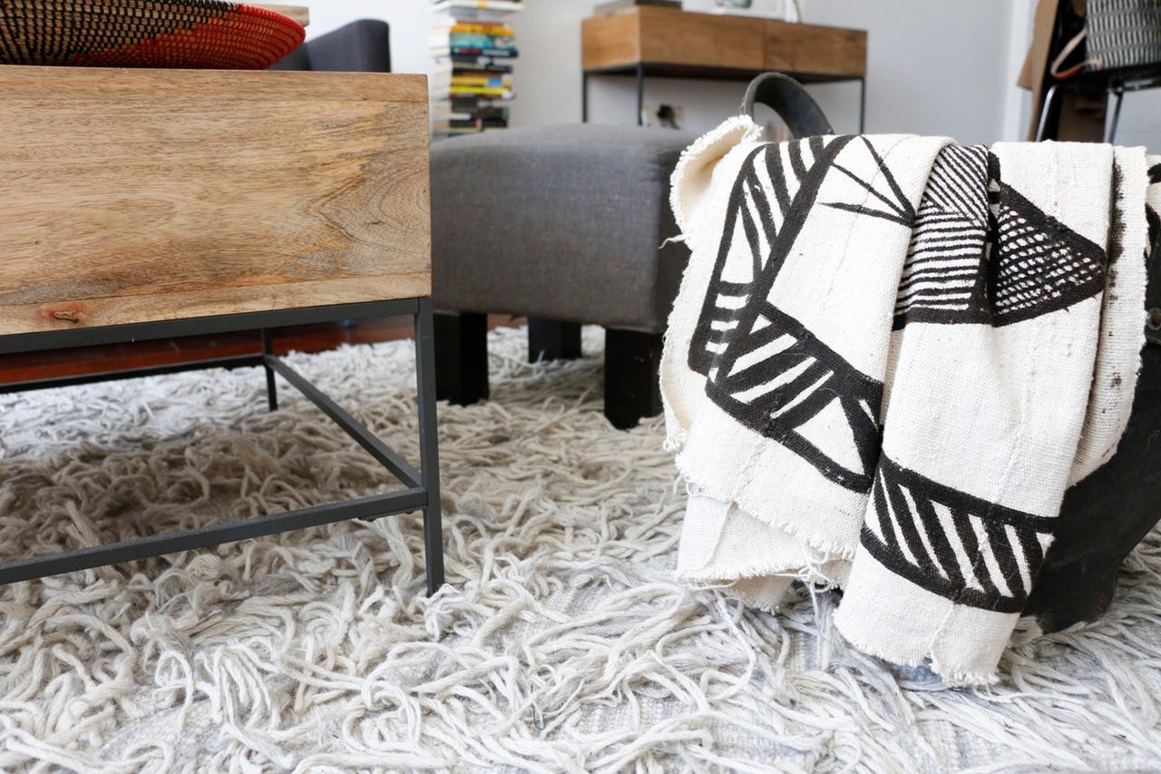
Without color to be the star of the show, your space needs something to stand out and draw your eye, otherwise you’ll feel like you’re living in a boring, beige world. Enter: texture! Especially when you’re toning down the brights, amping UP the woven, nubby, fuzzy, shiny and knit items in your room will really add something special.
Think about it like this: just like you often see two or three colors making up a “look” in certain rooms, try to add two or three textures instead. So if your friend has a navy sofa with a few green throw pillows and a maroon blanket, YOU can get the same interesting look in your own living room if your grey sofa is accented with a chunky knit grey throw and flanked by two high-gloss end tables (remember, mirrored surfaces count as texture too!). Instead of highlighting your floor with a colorful rug, add a woven jute rug (bonus: they are dirt cheap) and layer a shag over it. A textured room always feel warm and inviting, like your home is giving you a hug. Sounds good to me.
2. Add Contrast
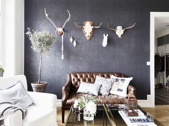
You don’t want to add color but you can still take advantage of a technique often used with colorful looks — contrast. Placing contrasting shades together adds lots of graphic interest. You can go simple with stripes or color blocking, or more complex with an intricate pattern.
Just make sure your colors have some range. Black and white is a classic combo, but also consider contrasting shades that aren’t quite as dramatically different. Grey and white always looks sharp; so does taupe and black. You can even contrast shades within the same color family, like charcoal grey with light grey. It will create a more subtle look, but still be plenty punchy. Just make sure there’s a noticeable saturation difference (that’s what creates the contrast).
3. Match up Neutral Tones
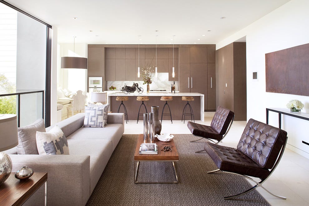
Without getting too technical about color theory here, we need to talk about tone. We tend to assume that any neutrals will work together because, well, they’re neutral! Not quite. We’re using the word neutral here to imply lack of color, but in fact, any color can be considered a neutral if it has equal amounts of warm and cool tones. That said, when putting together a room full of color-free furniture (i.e. one definition of neutral), make sure you’re matching up tones, because even if we call grey and beige and cream neutral colors, they can in fact be warm or cool.
Still with me? Let me share an example. Brown is usually a warm color but grey is usually cool. Cream is a warmer shade, white is cool. So, brown and cream go great together, as do grey and white.
What’s more important than matching up shades is matching up undertones! If most things in your room are warm and you bring in something that’s cool, it’s not going to look quite right (and you may not be able to put your finger on why). When the undertones work, the look will work. Easy as that.
Images via home-designing.com
